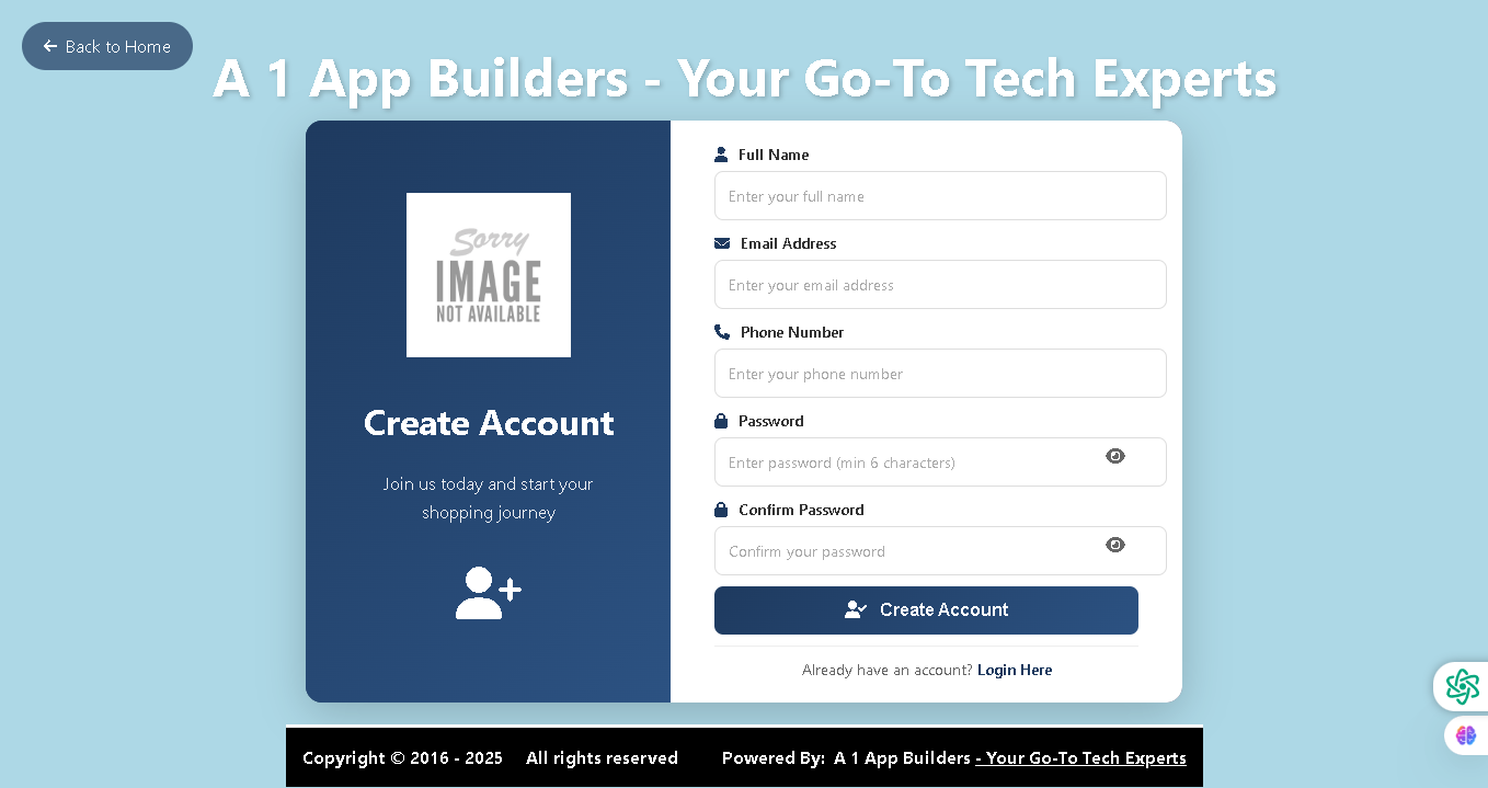
Welcome to the A1 App Builders Account Creation Page—a professional registration interface designed to onboard new customers into the Louis eCommerce ecosystem. This page serves as the gateway for users to join the platform and begin their shopping journey with comprehensive tech solutions.
The layout features a dual-panel design with soft blue backgrounds, clear form fields, and intuitive navigation that makes account setup quick, secure, and user-friendly.
🌟 Key Features:
- Navigation Header: A prominent "Back to Home" button in the top-left corner allows users to return to the main storefront at any time.
- Branding: The header displays "A1 App Builders - Your Go-To Tech Experts" in large white text, establishing brand identity and credibility.
- Left Panel - Account Benefits: A dark navy blue section highlights:
- A placeholder for a user profile image
- "Create Account" heading with bold white text
- Motivational tagline: "Join us today and start your shopping journey"
- User plus icon symbolizing account creation and new member benefits
- Right Panel - Registration Form: A clean white form section with five input fields:
- Full Name: Text input with placeholder "Enter your full name"
- Email Address: Text input with placeholder "Enter your email address"
- Phone Number: Text input with placeholder "Enter your phone number"
- Password: Secure field with minimum 6 characters and eye icon for visibility toggle
- Confirm Password: Matching password field with visibility toggle
- Form Security: Eye icons on password fields allow users to show/hide passwords for verification without compromising security.
- Call-to-Action Button: A prominent dark blue "Create Account" button with user icon drives conversion and clearly indicates the next step.
- Login Link: Text stating "Already have an account? Login Here" provides an easy path for returning customers.
- Footer: Black footer with copyright information and A1 App Builders branding maintains professional consistency.
- Color Scheme: Light blue background, dark navy left panel, white form panel, and dark blue buttons create visual contrast and guide attention.
💡 Why It Works
This registration page reduces friction in the signup process through clear field labeling, logical form layout, and minimal required information. The split-panel design balances visual appeal with functionality, while the "Already have an account?" link acknowledges existing customers and prevents user drop-off. Password visibility toggles enhance user confidence during setup. The consistent branding and professional aesthetic reinforce trust and encourage completion of the registration process.
Policy:
All upgrades are free.
This is a try-before-you-buy product; no refunds are issued after purchase.